


Camille Graeser was born in 1892 in Switzerland, but lived in Stuttgart for some time from the age of six onwards. He learnt the carpenter’s trade in order to support his widowed mother and family. In 1911 he took the course for furniture construction and interior architecture at the Royal College of Arts and Crafts, where he was subsequently accepted into the master class. At the same time he also took lessons in drawing and painting. During this period he met up with and became a member of the avantgarde in Stuttgart. After completing his studies, he came into contact for the first time with the work of Chagall, Kandinsky, Klee and Archipenko in the Sturm Gallery of Herwarth Walden, and made his first steps in the direction of abstract art.
In the following years he worked in Stuttgart as interior architect, product designer and graphic artist in advertising, but he often had to make unhappy compromises as there was not sufficient interest in his conception of modern functional design. His initial successes in design were restricted to technical competitions. In 1918 he had his first personal exhibition, and in 1927 he was commissioned to provide the interior design of a model home in the revolutionary Weissenhof village of the Association of German Factories near Stuttgart. These successes led to his increased reputation as a designer. His woven carpets for the model home were his first art works in the direction of geometric constructivist art.
It was not until Graeser was forty-five years old that he devoted all his time to painting. His first concrete art painting dates from this time. Camille Graeser defined the concept „concrete“ as follows:
„The word ‘concrete’ in art implies a renunciation of the aim of representing an optical objective world.
It implies the forming of a new, clear pictorial world.
It implies the building, constructing and developing of geometrically founded rhythms.
It implies the strictly logical creation and design of works of art, with their own intrinsic laws.
It implies the interplay of measure and value of colour, form and line.
It implies the exclusion of all unonscious or unintentional elements.
The word ‘concrete’ in art comprises the visibly designed pictorial tone, as in music.
It implies purity, law and order.“
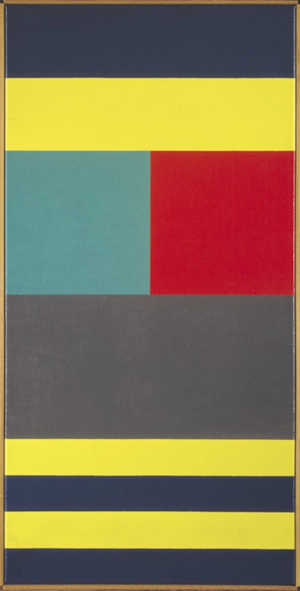
From his first years as a painter up to the 1960’s Graeser’s work became increasingly reduced and also more concentrated. His main intention is reflected in the title „Relation“ of his painting from 1966, which is in the Arithmeum Collection: in his reduced compositions Camille Graeser wanted to represent relations and form connections between colours, coloured areas and simple proportions. In this picture his basic shape is the square. Two horizontally adjacent squares make up the width of the picture, while their height makes up a quarter of the picture height. The red and green squares are counterpoised as a pair of complementary coloured areas, but as this contrast is not perfect, their common edge flickers optically. This effect imparts such a weight to the only vertical line in the picture, that it is able to form a counterbalancing pole to the horizontal components of the picture.
Above these two squares there are two identical rectangular strips, together having an area equal to that of the two squares, and one is coloured yellow and the other blue. Here Graeser has juxtaposed the two colours with the greatest light-dark contrast, while the complementarily coloured red and green squares have the least light-dark contrast. Immediately below the squares there is a large rectangle, again of an area equal to that of the two squares, coloured a neutral grey.
Taking the area of one of the squares as unit of measurement, the rhythmic composition of the picture from the top down corresponds to the following sequence of areas of the strips:
1+1=1+1=2=½+½+½+½. Thus, in the upper half of the picture each of the four coloured areas has the same area, while in the lower half there is one with twice the area and there are four with half the area of one of the squares. So the amount of yellow area in the top quarter of the picture equals that in the bottom quarter, and the same for blue. Between them there is a large square consisting of the red and green squares and the grey rectangle, which stands out on account of its very homogeneous colour scheme against the richly contrasting blue and yellow strips. This work of art is an example of how Graeser succeeds in creating a very complex composition with very reduced means.